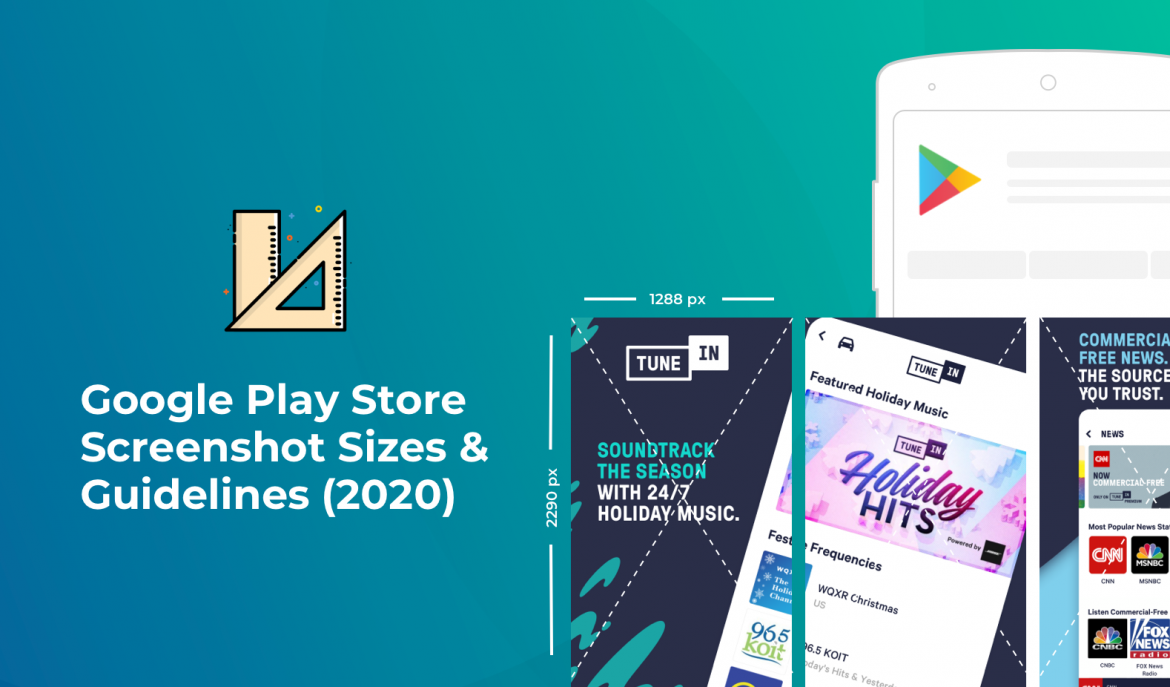
Do you want to know the correct Google Play Store screenshots sizes? If yes, then you came to the right place.
Screenshots play a vital role in your app store optimization success. With screenshots, you can showcase what your app is all about, what it is capable of, and the reasons your target audience should download it.
However, if you really want to maximize the results you get from your app screenshots, you need to make sure they are of the right size. You must also adhere to Google Play’s guidelines to ensure they get approved and featured.
So, in this post, let us discuss the right Google Play Store screenshot sizes and its guidelines.
Why do Android screenshot sizes matter?
Images attract people more than written words. In fact, in some cases, screenshots are enough to convince users to download and utilize your app. Sadly, not many people would read your app description. Instead, they make instant decisions based on your screenshots.
Now, here’s something you also need to know. Google Play has made a few changes in how they display apps. When previewing your app, people see your screenshots first because it is shown above the page.
Moreover, aside from your Google Play homepage, people also see your screenshots on search results. Thus, with great screenshots, you can easily get people’s attention and eventually lead them to download your app.
Google Play App Screenshot Guidelines
If you have tried to upload screenshots on Apple App Store, you would most likely see that Google Play is more lenient. Generally speaking, it is easier to upload screenshots on Google Play with fewer rules than Apple App Store.
The first thing you need to know is that Google Play requires you to provide at least two screenshots, but you can add up to eight screenshots. Users can view these screenshots on smartphones, tablets, Android TVs, and Wear OS by Google.
While Google Play Store does not require you to use all eight slots, you might want to consider using all of them. Every screenshot slot is an opportunity for you to showcase your app’s features.
Moreover, if you’re going to upload a preview video of your app, please note that the video would show up first before the screenshots.
Correct Google Play Screenshot Sizes – 2021
When it comes to screenshots, it is not enough to have great and impressive looking visual assets. You have to have the correct Google Play Store screenshot dimensions.
One good thing about Google Play is that they would automatically adjust your screenshot size to match the size of the current device’s screen. However, this doesn’t mean that you can upload any screenshot of different sizes.
To make sure your screenshots look impressive and beautiful, here are the important details you need to remember:
- JPEG or 24-bit PNG (no alpha)
- Minimum dimension: 320px
- Maximum dimension: 3840px
- Up to 8 MB file size
- 16:9 aspect ratio (for landscape screenshots)
Please note that you can’t upload screenshots that have a maximum dimension twice as long as the minimum dimension.
Google Play Feature Graphic Size
If you want to bring your app’s visual assets to the next level, you’ve got to include feature graphics. This is different from the ordinary screenshots. With feature graphics, you can get your app featured in a lot of places in Google Play.
These places may include:
- Cover image for your promo video
- On the Play Store Android app displayed in a large format
- On app collections in a large format
- On the list of recommended games
Usually, your Google Play Store shows you feature graphics together with other top-level app metadata such as app title and icon.
When you submit your feature graphic, you get to attract more users and convey your app’s features in a more powerful manner.
When uploading feature graphic, be sure to meet these requirements:
- JPEG or 24-bit PNG (no alpha)
- Dimensions: 1024px by 500px
- Up to 1 MB file size
Here are some important points to remember when choosing feature graphics:
- Choose an informative graphic.
- Keep important details of your feature graphic towards the center of your graphic.
- There’s a chance that Google Play Store will not show all parts of your feature graphic. Depending on the user-interface, a portion of your graphic would be cut off. So, you need to remember the cutoff zones of your graphic, which is about 15% from all four edges. Any important part of your image should not be located in the cutoff zone.
- Add vibrant colors into your feature graphic to quickly grab people’s attention. Dark gray and even pure white motifs don’t usually perform well.
- Use colors for your feature graphic that complement the color of your app icon, app, and other visual assets so people can easily associate your feature graphic with your app.
- Things to avoid in your feature graphic include any form of taglines, time-sensitive content, overloading your graphic with too many fine details, and repetitive image elements.
More screenshot size recommendations
Remember that screenshots are not just shown on your store listing, but rather they are displayed across the Google Play platform. Thus, you need to choose screenshots that effectively show the essence and benefits of your app or game.

Google Play suggests that when choosing screenshots, don’t include images that show ranking, price, Play Store performance, and promotional information.
If you’re promoting a game app, provide three landscape (16:9 aspect ratio) images. This is important because Google Play Store shows groups of recommended games in a bigger format rather than just the small one. If your people play your game in portrait mode, you need to add the three landscape images after your portrait screenshots.
Final Thoughts on Google Play screenshot sizes
You have just read the important guidelines to remember when choosing the correct Google Play screenshots sizes. If you need further details, you can read Google Play’s screenshot size and guidelines here.
Be sure to apply them when uploading screenshots. When you do, your app would surely have a better chance of getting discovered, downloaded, and used by many loyal fans.
