
Creating the best mobile app icon design can be a daunting and challenging task. Why not? Your app icon is the first piece of graphic design people will see or interact with. Thus, it is not surprising to see that the app icon plays a huge role in the success of your app.
So, the million-dollar question now is, “How to design the best app icon that will consistently grab people’s attention?”
Thankfully, you don’t have to look far and wide for the answer. In this post, let us share with you the best tips in designing app icons and the tools you can use to generate the best app icon for you.
What is an app icon?
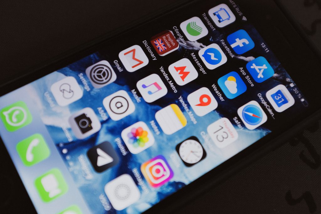
If you have been using the internet and your smartphone, you should probably know what an app icon is. It is the small image you see that represents a particular application, product, business, or service.
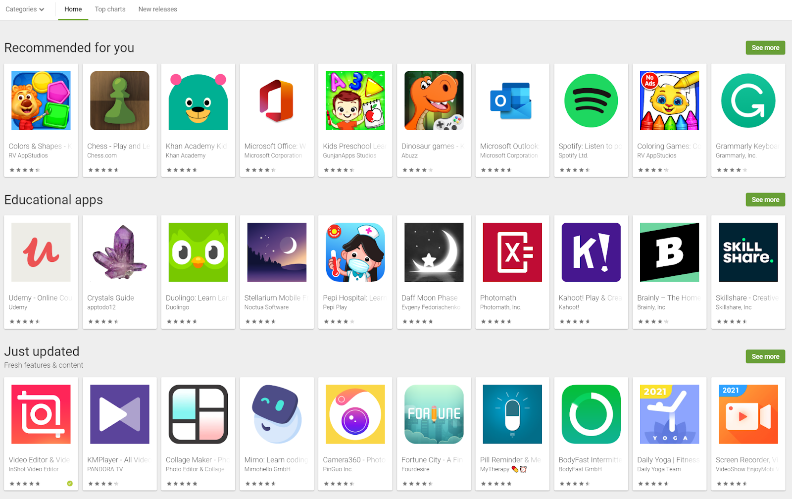
Here are some examples of app icons you’ll see in the Google Play Store:

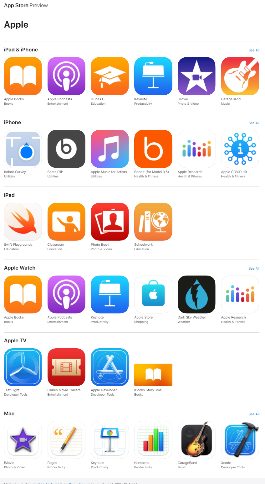
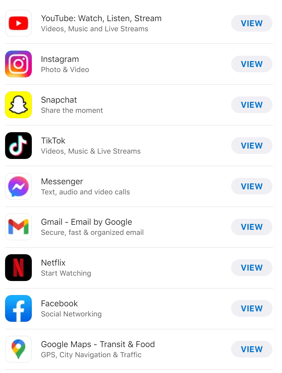
On the other hand, these are the app icons you’ll find in the Apple App Store:

As you can see, app stores use app icons as the most prominent part of your app. It is how they feature, showcase, and display the app(s) you are promoting.
Why are app icons important?
According to one estimate, there are around 1.96 million apps in the App Store and 2.87 million apps in the Google Play Store. With so many apps fighting for users’ attention, the battleground for supremacy is fierce. One of the greatest weapons you can use to rise above the competition is the app icon.
Here’s another interesting findings that could change how you view app icons:
Based on a study made by SplitMetrics, a great app icon can increase conversion up to 560%!
Now, that’s the reason mobile app icon designs are super important. Needless to say, it is impossible or nearly impossible to succeed without an impressive app icon.
Think of your app icon as the representative of your brand in app stores. People will judge your app according to your icon. Yes, I can hear you say, “Don’t judge the book by its cover.” That’s really true, but in most cases, people don’t follow that advice.
Remember, the first impression lasts. Whether you like it or not, you only have a few seconds to impress your potential users. If you can’t do it with your app icon, nothing will.
When it comes to mobile app icon designs, a picture truly paints a thousand words. Your app icon is there to communicate the what’s, who’s, and why’s of your app.
That’s how crucial it is to have the right app icon. So, take time to invest in your icon. If done right, it will dramatically improve your app’s success.
How to make your mobile app icon design stand Out?
The answer is to put yourself in the shoes of your potential users. You might be full of ideas which you think are great, but it is not you who will use the app, but the people you’re targeting.
So, in the final analysis, it is not your opinion that matters. It is your target audience.
When brainstorming for an app icon idea, you must know who your users are, what interests them, and most importantly, what would be that one thing that will make them want to download your app.
When you get to answer these questions, it would be easier now to make your app icon stand out.
Indispensable qualities of great mobile app icon designs
So, how does an impressive app icon look like? How can you tell that an app icon is successfully doing its function? In short, what are the qualities you should ensure your app icon should have?
Here are the top three qualities of powerful mobile app icon designs:
1. Simple
Successful app icons don’t need to be complicated. You can make more by using less.
A quick look at some of the most successful apps in the app stores would tell you that their icons are rather simple and minimal.
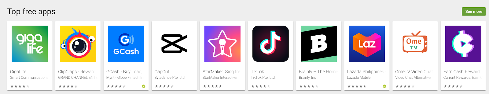
Check out these top free apps in the Google Play Store:

How about the Apple’s Top Free Charts:

Simplicity is powerful when it comes to app icon designs. So, there’s no need to overdo and overload your app icon when it’s time for you to design it.
2. Memorable
A mobile app that can easily grab people’s attention and stick into their mind is what you should be aiming for. Best app icons are meant to create a connection between you and your audience. It needs to be interesting enough so people can easily recall and recognize your app.
3. Relevant
When we say relevant, it means that your app icon is specifically targeted to your audience as well as in your market.
If you’re in the social media industry, then you should choose colors and elements that communicate togetherness and connection. If your app is for kids, then bright colors that promote fun, excitement, and energy should be your choice.
You get the idea. Your app icon should be relevant — meaning, it perfectly fits in your chosen niche, market, and industry.
The best tips for creating awesome mobile app icon designs
Now that you already know the qualities of a great app icon, it’s time to know the best tips and practices you should remember in the design process.
1. Use the right mobile app icon design format
You can easily ruin your app design if it doesn’t have the right size and format. Thus, it is vital to follow the set rules and guidelines of your chosen app store.
Just to give you an overview, in the Google Play Store, you need to have the following:
- Final size: 512px x 512px
- Format: 32-bit PNG
- Color space: sRGB
- Max file size: 1024KB
- Shape: Full square
- Shadow: None
There are other specific tips and guidelines you should consider. So, please read the full guide of Google Play Store.
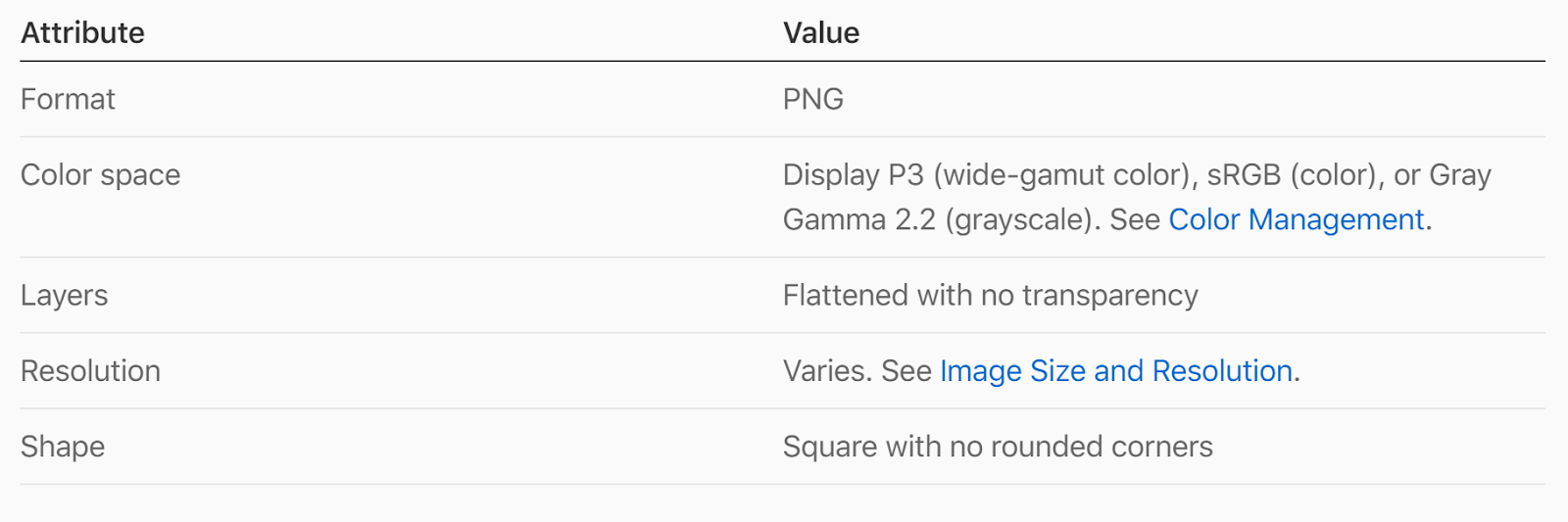
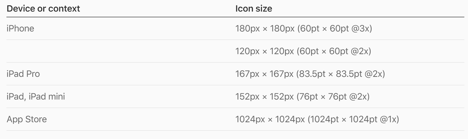
On the other hand, the app icon specifications can be more complicated in the App Store. The reason is that you have to submit different sizes for various devices.
Here are the App Store specifications to follow:

Here are the icon sizes for each device:

For more details, we highly recommend you read the official App Store’s app icon guidelines.
2. Create an mobile app icon design that speaks
Your app should be simple enough so people can easily understand what your app is all about. Bear in mind that people constantly seek information in the easiest and quickest way. If your icon looks confusing and it doesn’t say much about what your app is all about, then you can say goodbye to a lot of your potential users.
3. Be consistent in your brand design
If you already have a brand design, keep that in mind when creating a new app icon. Check out these app icons from MS Office 365:

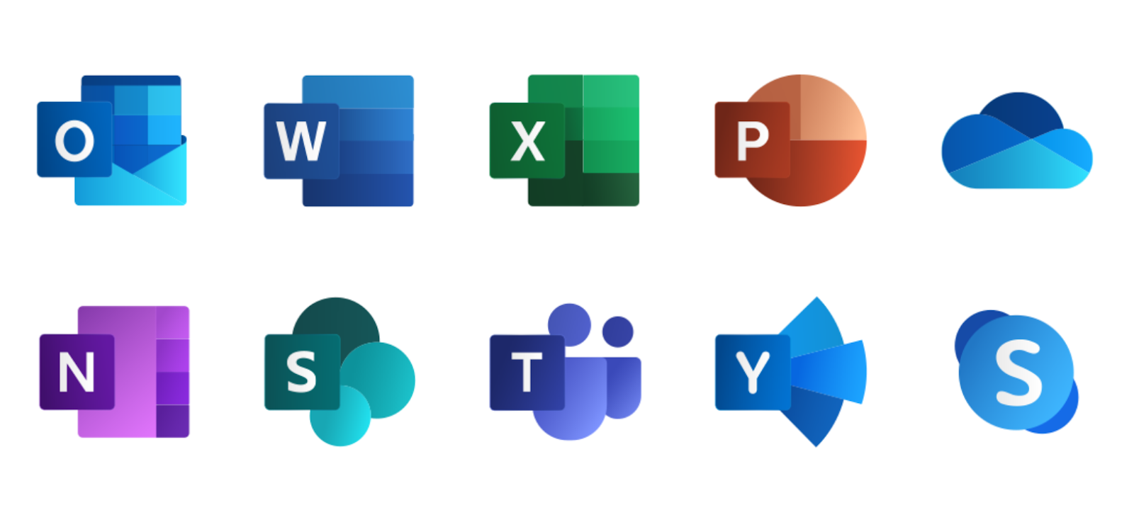
In just one look, you already know that they are part of one brand or group of products from Microsoft.
This is an effective strategy if you want to bring uniformity and harmony to all your products and services. It’s effective because it allows your users to easily recognize your brand and foster better brand loyalty.
4. Don’t settle with your logo
An mobile app icon design and your brand logo are two different things. However, at times, it is easy to get them mixed up. Of course, you can use your brand logo as your app icon if your brand logo is already popular. That’s why you get to see Facebook, Twitter, Nike, and Wendy’s using their brand logo as their app icon.
However, if your brand isn’t renowned yet or you’re just starting out, it is best to create a different icon that would best impress your users.
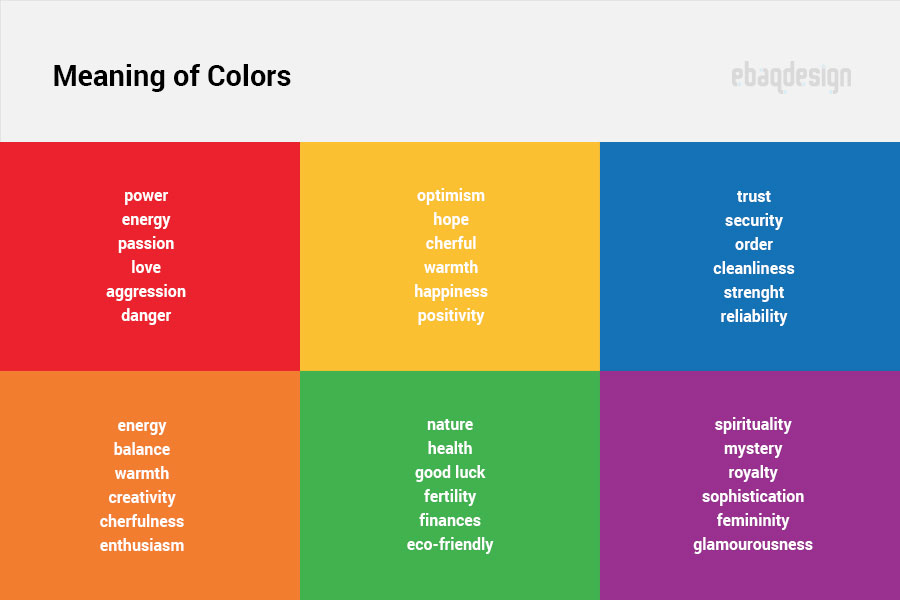
5. Choose the right color combination
When you combine colors in the best way possible, you’ll surely have an amazing app icon. In this regard, it is best to know what each color means in psychology. This is a huge topic so, let me just share with you an image that explains the meaning behind colors:

6. Consider the background
We know that Apple and Google love to update their platform. Sometimes, these updates can affect the appearance of your app icon.
One example would be the dark mode update. This update allows users to use a dark background. So, if your app icon already has black colors, then it can easily ruin your overall display.
Here’s how dark mode can affect your app’s appearance in the app stores:

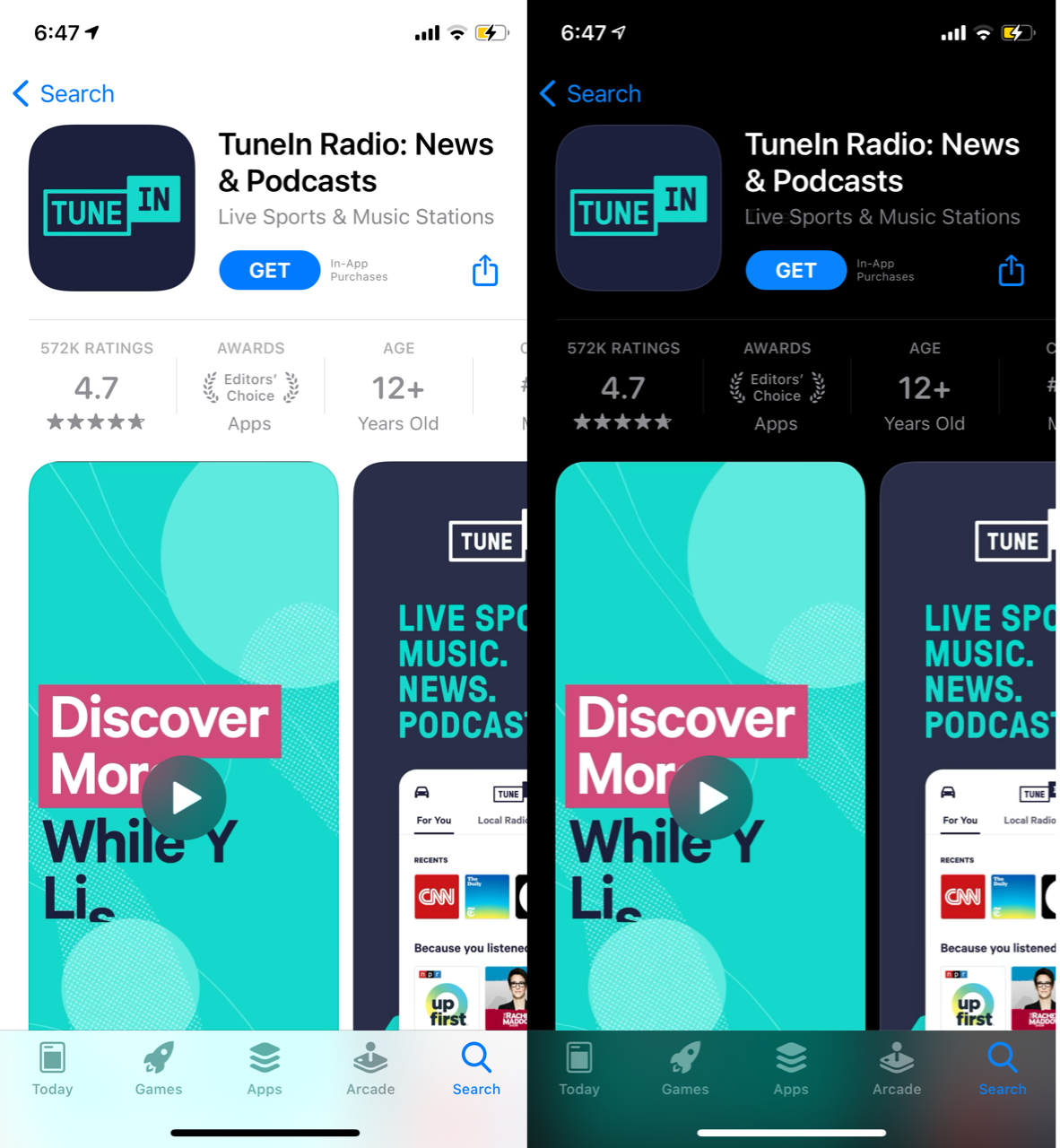
So, when choosing a color, be sure to think about the background of the app stores both in current and future updates.
Another reason for you to be careful in using background color is that once your app icon is downloaded, your user would have a different background used in their device. So, it’s a good practice to use a background color in your mobile app icon design that could easily blend with any color.
7. Avoid words in your mobile app icon design
App icons are commonly displayed as a small image. So, what happens if you use a lot of words in your app icon? Obviously, they will not only be difficult to read, but they will simply be ignored.
Here are some examples:


As you can see, these apps won’t stand out in a crowded app store. Yes, there are times when using words or letters would work, but they are simply the exception, but not the rule.
Words and pictures are different representation elements. If you mixed them up, your app icon would look cluttered and distracting.
Here’s what the Apple App Store has to say about using words in app icons:
Use words only when they’re essential or part of a logo. An app’s name appears below its icon on the Home screen. Don’t include nonessential words that repeat the name or tell people what to do with your app, like “Watch” or “Play.” If your design includes any text, emphasize words that relate to the actual content your app offers.
Mobile app icon designs should focus more on the essentials. So, use words only and only if they will add value to your app icon.
8. Be unique to stand out
This tip requires you to strike a balance between being unique and being relevant. There’s no doubt that if you belong in a specific niche, there are some elements that you should include in your app icons that should immediately tell your users what you are. That’s why you can see apps in the same niche sharing almost the same elements.
Check out the apps that come out when you search “to-do list.”

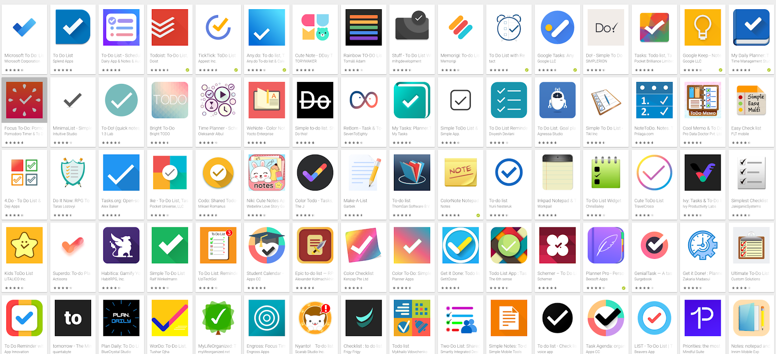
Do you see how similar they are? Most of these apps come with a check image.
So, to effectively stand out, you would need to retain some elements applicable to your niche, but at the same time being unique.
Why is this important? For one, app stores try to categorize or group together similar apps. So, if your app isn’t popular yet, you need to ride on the popularity of other apps. If your app is seen as similar to a popular app, then it can be featured alongside other popular apps, thereby, increasing your app’s visibility.
Now, it can be tricky to be similar but unique at the same time. That’s where your creativity comes in. There is no one-size-fits-all solution here. You just have to do your own research.
To help you in this regard, here are a few tips on how to be unique:
- Check your competitors’ apps. Line them up together and see what makes them stand out from each other.
- Consider what others are doing. See if there’s a way you can do things differently to make your app icon unique.
- Play around with various compositions and colors. Usually, the right color combination is simply waiting for you to discover.
- Study your favorite apps. Deconstruct their app elements. Try to isolate each element and see what made you like the app. Once you have identified what makes a popular app popular, you can then try to apply that in your app, too.
Be sure that if you want to be unique, you need to be unique in a good way and not the other way around. Everyone can be unique, but how they do it makes the big difference.
9. Make your app scalable
Scalable means that your mobile app icon design looks great whatever size it is displayed in. Whether it is small or big, it should consistently communicate the message you want it to convey.
10. Avoid using transparent elements
Transparent icon elements can easily disappear in various backgrounds. That’s why it is a must that your app icon’s elements should be seen whatever background it may be put against with.
11. A/B test your mobile app icon design
Here’s something you need to understand:
You might not produce the best app icon right on the first try.
In most cases, you won’t know whether you are using the right app icon or not unless you already get your feet in the water. What we mean is that you can only make an informed decision once data is available.
That’s where A/B testing your app icons comes in. You might be torn among various app icon designs. So, the best thing you should do is test them.
Did you know that A/B testing can increase the conversion rate of your app by as much as 26%? That’s why you should not ignore A/B testing.
By giving each app icon enough time to get featured on your app page, you get to see which one gives you the maximum results. With A/B testing, you won’t blindly pick which app icon is the best, but you will surely create more data-driven decisions.
How to perform A/B testing can be a huge topic, so please feel free to read our full guide on how to A/B test your app images.
If you wish to successfully perform A/B testing, you need to consider Metrikal. Aside from A/B testing, it keeps track of all your ASO optimization efforts and campaigns in just one dashboard. So, give it a shot and see how it can dramatically improve not just your app icon, but the overall success of your business.
Best mobile app icon design tools
We just read the different tips and guides on how to create the right mobile app icon design. Now, let’s take a look at some of the best tools, which you can use to generate your image.
Canva
Canva is among the most popular free graphic design apps out there. While it is free, you can also pay for their premium features for more impressive ways to create your app icon.


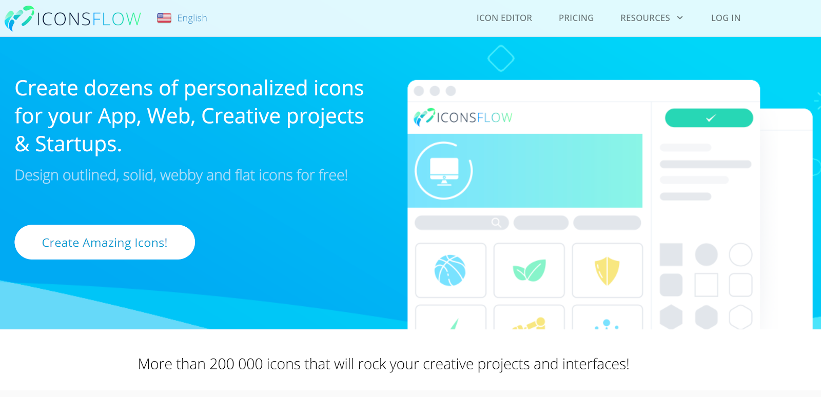
IconsFlow
Another amazing app icon tool that you should consider would be Iconsflow. They help you “design outlined, solid, webby and flat icons for free.”

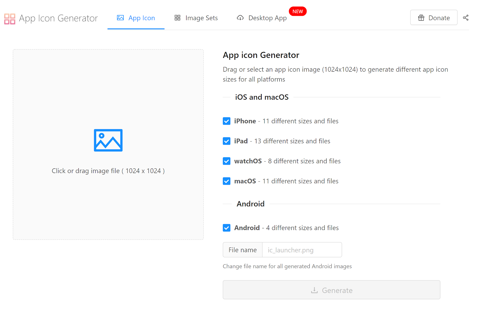
App Icon Generator
This online app icon tool is easy to use. You simply need to select or drag your app icon image to their tools. The App Icon Generator is more like helping you create different image and file sizes for your app icon instead of really generating the app icon itself.

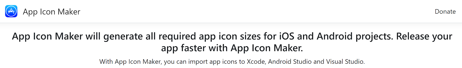
App Icon Maker
App Icon Maker works similar to the previous app icon tool we mentioned above. You can upload your mobile app icon design and the tool will generate all needed sizes for iOS and Android projects.

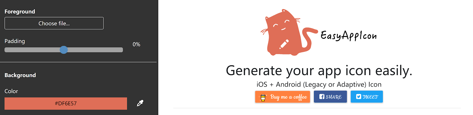
EasyAppIcon
If you want to ensure your app follows the size guidelines of app stores (which can be complicated at times), then EasyAppIcon should come in handy. With EasyAppIcon, you can resize and preview your app icon in real-time, generate and download your app icon quickly and easily, and create Android Adaptive Icon online.

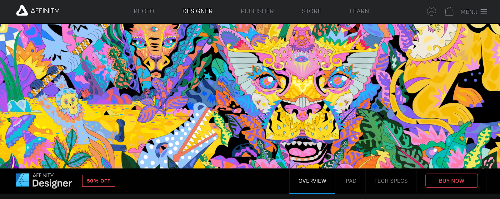
Affinity Designer
If you’re looking for a clean UI and vector app icon maker, you should check out Affinity Designer. This tool is even great for beginners who are looking for a quick way to create app icons.

Final thoughts about app icon tools
These are just some of the mobile app icon design tools you can use. Just a word of caution here:
While these tools can be really helpful, don’t settle with using templates, stock photos, or common elements. If you want to stand out, you need to invest time, energy, and money into your app icon.
Make your mobile app icon design count!
One thing that separates the ordinary from the extraordinary apps in the App Store and Google Store is the app icon. Regrettably, there are a lot of app icons out there that are just bland, boring, and outright mediocre.
Thankfully, you can use this to your advantage. Make sure your app icon stands out from the rest and make your mark in the app stores.
Don’t think of your app icon as something you can simply consider seriously after you have created your app. It should be part of your overall app design!
As you may have already realized, it is not easy to find an attractive icon. What’s even harder is to create a single piece of graphic design that will effectively summarize what your app is all about.
Nevertheless, with the powerful tips and tools we have shared here, we hope you become equipped and confident to take on the challenge.
Now go out there and create the best mobile app icon design this world has ever seen!